")
- Details
- Written by Cristina Ojea Calahorra
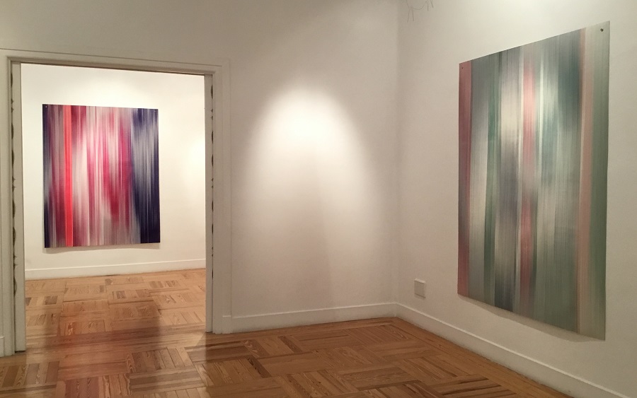
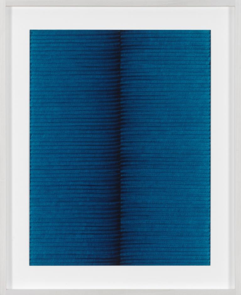
A "glitch" in the Information Technology and videogame world refers to a system error that has no negative impact whatsoever on performance, playability or stability. On the contrary, it is not uncommon for users to turn a glitch to their advantage. The essence of Caroline Kryzecki's (Wickede/Ruhr, Germany 1979) work, currently on show at Madrid's Bernal Espacio Gallery in her first ever solo exhibition in Spain, is partly that kind of glitch. That unforeseen error whose ocurrence only reinforces the fact that human nature is present. The exhibition comprises a collection of works on paper of various sizes (50 x 35 cm, 100 x 70 cm or 200 x 152 cm) in which the image is achieved using only horizontal or vertical lines and is based on a motif of repetition
A "glitch" in the Information Technology and videogame world refers to a system error that has no negative impact whatsoever on performance, playability or stability. On the contrary, it is not uncommon for users to turn a glitch to their advantage.
The essence of Caroline Kryzecki's (Wickede/Ruhr, Germany 1979) work, currently on show at Madrid's Bernal Espacio Gallery in her first ever solo exhibition in Spain, is partly that kind of glitch. That unforeseen error whose ocurrence only reinforces the fact that human nature is present.
KSZ 50/35–51 Courtesy of: Sexauer Gallery, Berlin / Bernal Espacio Gallery, Madrid.
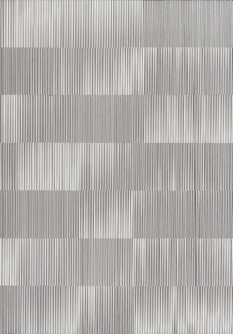
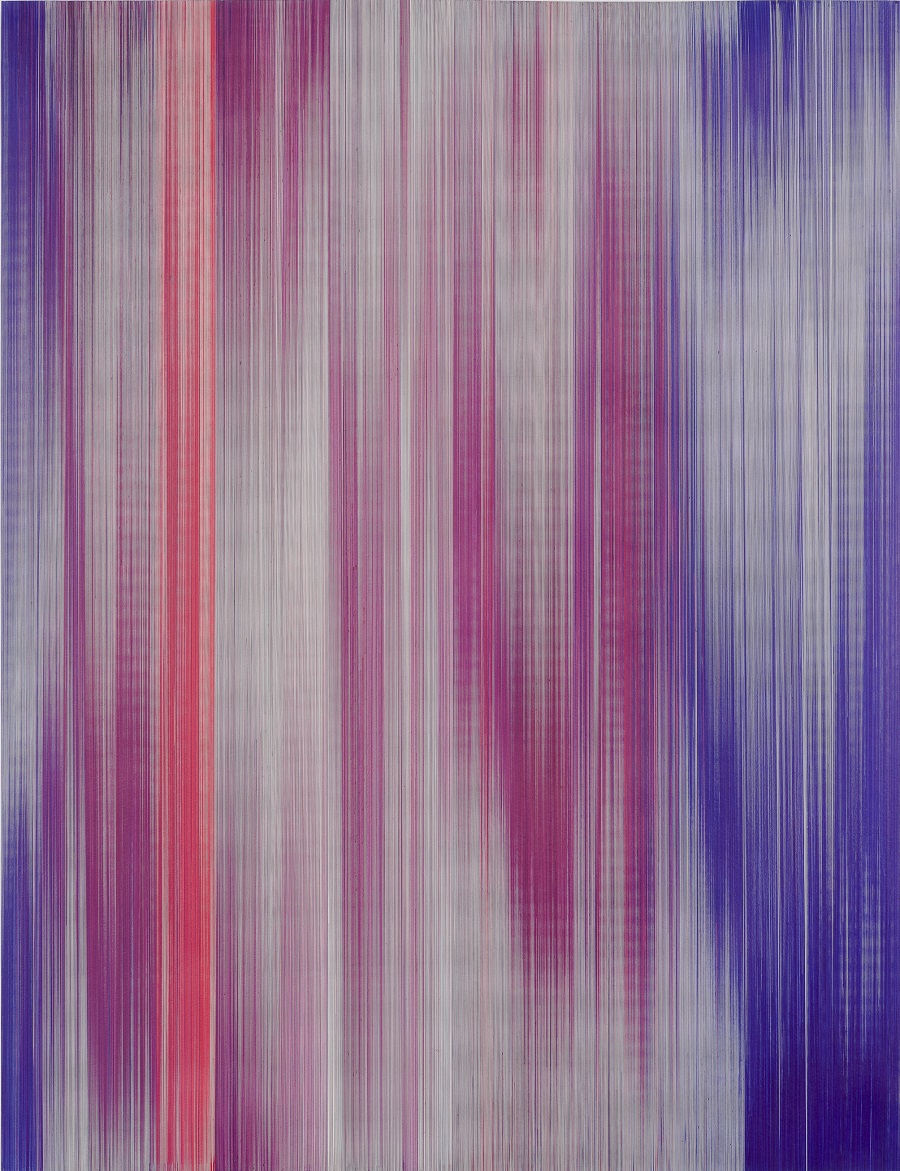
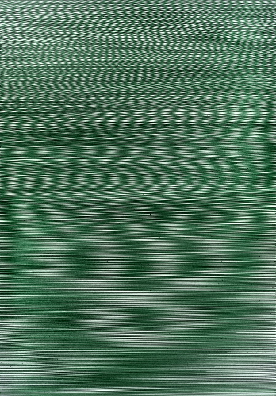
The exhibition comprises a collection of works on paper of various sizes (50 x 35 cm, 100 x 70 cm or 200 x 152 cm) in which the image is achieved using only horizontal or vertical lines and is based on a motif of repetition. These works are closely linked to the digital world by their automated appearance. A carefully carried out job in which each impeccably-drawn line is separated from the next by a mere 3mm and would seem, at first glance, to be the printed product of some digital data processing mechanism.
However, spotting that tiny defect in the system, that almost imperceptible line that is out of place, helps us to step away from a "digital" reality. Like when some discordant note in a dream makes us aware that we have just dreamed, those little mistakes in the drawing are what make us realise that what we are looking at is, in fact, totally analogous and hand-drawn with pens.
KSZ 200/152-06 Courtesy of: Sexauer Gallery, Berlin / Bernal Espacio Gallery, Madrid.
Kryzecki's methodology manages to stop time in its tracks, not just for the patently laborious determination to find her own language, but also because she is radically opposed to what modern society demands of us. In a world of fast and fleeting consumerism, chained to constant new starts and the incertitude of our "liquid modernity", as described by Zygmunt Bauman, the artist here reclaims our attention to detail and a reflection on a geometric abstraction that seems encripted and apparently inaccessible to the spectator.
She alone has access to an algorithmic system made up of patterns of repetition, a system of codes all her own that, nevertheless, possess a huge power of attraction as much for their aesthetic beauty as for their ability to depict infinite horizons and to hint at realities beyond mere lines on a page. The works require close inspection and dedication although, in some ways, there is no secret message to decipher. The work is the representation of Kryzecky's interpretation of the parameters of her environment for which she needs to establish structures and to order the chaos of what is considered "normal". It's an intimate and delicate work that transports us into its universe.
KSZ 100/70-11 Courtesy of: Sexauer Gallery, Berlin / Bernal Espacio Gallery, Madrid.
Caroline Kryzecky's work has as a starting point an archive of the pictures she has compiled, focussing on landscapes and, especially, the decorative images we see around us in our day-to-day lives. These references have always been present in her work, linked to geometry in both her more abstract paintings and in others less so where the lines were always accompanied by figuration. Without following pre-established parameters, her trajectory sometimes involved experimentation with objects or sculpture-like pieces. But her art took a different and deliberate turn when she started a residency in Istambul in 2010, arriving with absolutely none of her previous working materials or media at all. This was a voluntary gesture of closure that enabled her to discover a language with which to best express herself.
Blue, black, red and green are the colours she uses in her works - those being the four basic ballpoint colours - and she limits herself to the paper dimensions mentioned above. This self-imposed restriction has favoured the creation of her own personal code and has opened the way to the possibility of an infinite variety of combinations. And as she herself admits, this has served to expand her creative potential. In the same way that "error" became a powerful element in her work, she has been able to turn limitations into her greatest freedom.
View of the exhibition. Courtesy of: Bernal Espacio Gallery, Madrid
Demonstrating emphatically a divergence from other artforms based on shortcuts, she engages directly with each piece, tending and refining it until a language is obtained that needs no illustrations, whilst producing the most abstract and poetic version of the work. On entering the exhibition, visitors find themselves surrounded by the beauty of slow movement and transported to a lucid dream of infinite worlds.
(Translated from the Spanish by Shauna Devlin)
Caroline Kryzecki: Between The Lines
Bernal Espacio Gallery, Madrid
26 October ~ 30 November 2016
- Details
- Written by Maira Herrero
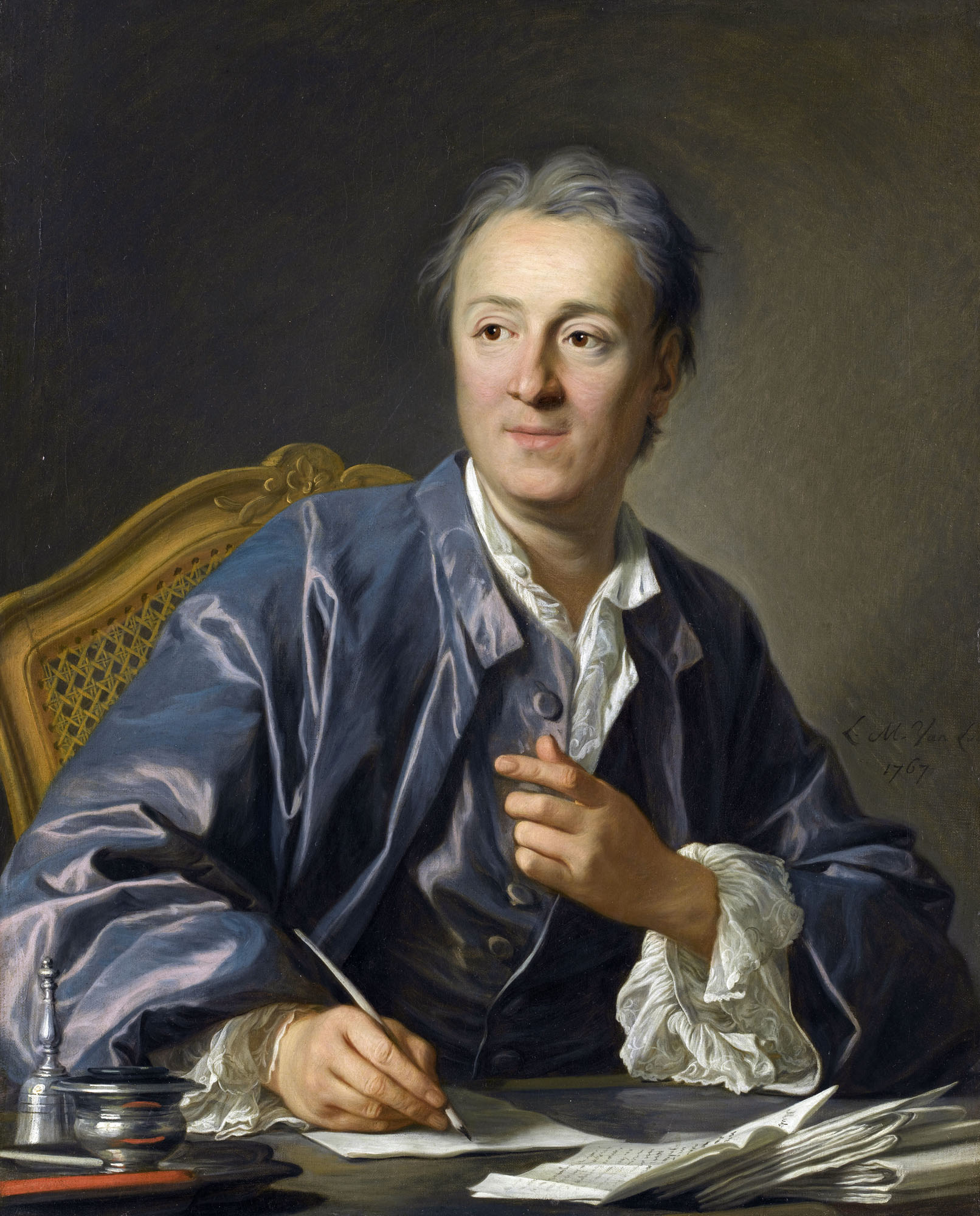
I suspect that the idea of writing about French convent life in the early 18th century had occurred to the brilliant philosopher, writer and "Encyclopedie" founder and editor-in-chief Denis Diderot long before the spring of 1758 when the dismal news of a young nun's misfortunes reached and scandalised Madame d'Epirey's progressivist Parisian salon circle. Diderot had never forgotten his own beloved sister's sad fate within the confines of an Ursuline convent at Langres, where she'd been secluded her whole life due to delicate mental health. The story of Marguerite Delamarre, the nun whose woes began at the age of three when her parents sent her to a convent where she would remain until her death, despite tireless and desperate efforts to escape a life of privation and sacrifice there.
|
Author: Maira Herrero, |
 |
I suspect that the idea of writing about French convent life in the early 18th century had occurred to the brilliant philosopher, writer and "Encyclopedie" founder and editor-in-chief Denis Diderot long before the spring of 1758 when the dismal news of a young nun's misfortunes reached and scandalised Madame d'Epirey's progressivist Parisian salon circle. Diderot had never forgotten his own beloved sister's sad fate within the confines of an Ursuline convent at Langres, where she'd been secluded her whole life due to delicate mental health.
The story of Marguerite Delamarre, the nun whose woes began at the age of three when her parents sent her to a convent where she would remain until her death, despite tireless and desperate efforts to escape a life of privation and sacrifice there. Her desperation led her to seek help down every ecclesiastical and civil avenue within her reach but all her efforts came to nothing and she died without ever savouring the liberation she so desperately craved. The news had such a spiritual impact on a free-thinker friend of Diderot's, the marquis of Croismare, that he tried his utmost to help the impoverished nun with his time and money, albeit, again, to no avail. This incident, coupled with his deep-seated uneasiness about the then-customary practice of locking away young women lacking wealth or good looks behind convent bars, became the perfect excuse for him to write this unusual novel: "I write on the spur of the moment. I put pen to paper on The Nun and at three in the middle of the night, I was still writing. It's no longer a letter, it's a novel. It will contain truths, pathetic truths." This is how Diderot described the initial stages of his book, written in a direct style, almost report-like but without losing its dramatic powerand conferring on the work a mark of authenticity that reveals the terrible background to a reality only just coming to light.
The Nun is an authentic treatise on 'woman' wherein Diderot looks deeply into certain problems of our human existence, the ones that continue to plague us despite the world having changed radically. France, the most intellectually and culturally developed country in the second half of the 18th century, continued for a long time to uphold the moral dictates of the Ancien Regime. The established social order would take a long time to adopt the premises of the Enlightenment. The Nun is a story in epistolic form, written in the first person by its protagonist Suzanne Simonin, a beautiful and intelligent young woman who finds herself deprived, against her will, of the life she had been destined for. Suzanne's voice denounces issues as universal as the role of women in society, the hidden goings-on in convents and religious orders, the shame and blame fanaticism of the Church and the cynicism of an intolerant society of the day.
The crux of the novel's question is in the protagonism of 'woman' and her quest for independance by means of the idea of having self-defined, free thought and the liberty to exercise it. Being faithful to oneself, not taking on others' blame, not taking God's name in vain are just a few of the reflective themes of this novel. Basic moral dilemmas that are still pertinent in our modern society and which serve Diderot's purpose of converting one individual's lived experience into the central analysis of everyone else's in the world at large.
We are not here confronting the existence, or not, of an authentic God. Neither are we doubting faith in itself. Rather, we are denouncing a religion that denies what is the most precious thing for wo/mankind: namely, liberty. Diderot's anti-clericalism here references the stifling of free choice and the imposition of, under the auspices of God's will, an enforced, cruel and sordid existence, with its inevitable consequences. The novel is quite the treatise on female behaviour in the face of arbitrarily and definitively imposed obligations by a society that sought to control and desexualize them. It is also a cry for tolerance. Enforced vocational holy orders, lives devoid of dignity, work with no apparent point to it: all are in the mix here along with fanaticism, melancholy, hysteria, sexuality, reclusion and the dogmatic cruelty of a dark, out-of-control world warning of eternal damnation. All of which were and are alien to individual values and reason, as espoused by Enlightenment advocates.
From 1780 onwards, the novel appeared in instalment form in Grimm's Literary Correspondence, a handwritten newspaper-like publication accessible only to a small group of European aristocrats. It would not be printed for a public readership until 1796, more than 10 years after Diderot's death and too late for the author to mount a defence against the heated controversy it caused.
It is worth not forgetting that Denis Diderot was one of the figures who did most to radically change the mentality of the civilised world. As one of the great and universal Enlightenment pioneers, he elaborated his interest in anything and everything with great wisdom and originality. His thinking has stood the test of time against the great challenges of modern history with exquisite and exceptional prose writing and he continues to be a guide to understanding the vagaries of life and and our own involvement in them. One doesn't have to 'read between the lines' to realise the ongoing pertinence and sense of this work since Denis Diderot first started writing it over 250 years ago.
The Nun by Denis Diderot, published in English by Oxford University Press, Penguin Classics and Folio Society
(Translated from the Spanish by Shauna Devlin)
- Details
- Written by Marina Valcárcel
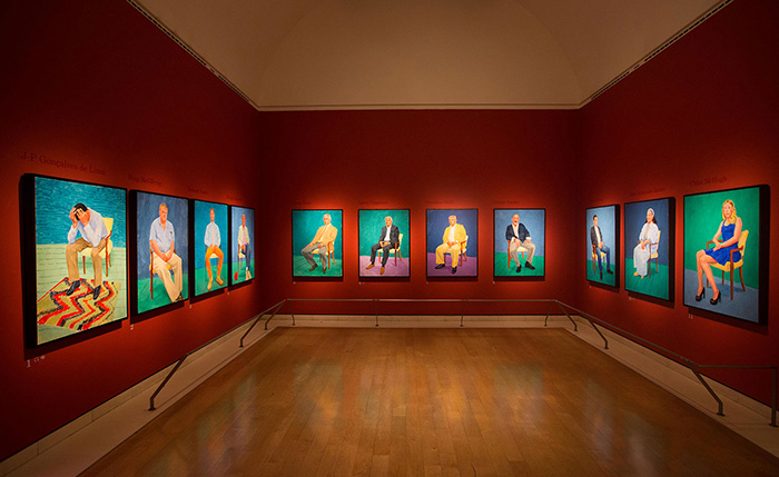
The three Royal Academy rooms dedicated to 82 portraits and one still life painted over the last two and a half years by an almost 80-year-old David Hockney, are heavy with the sensation one experiences in Tube stations at rush hour: a hum of murmurs, a mass of human bodies and, above all, a buzz of vital energy. Three narrow rooms without natural light or fresh air but with an all too conspicuous barrel-vaulted ceiling that, if one's mind were to wander down to the far end of the last room, create a peculiar dialogue between the public and the characters Hockney introduces us to. A kind of living theatre. Full-body portraits, hung or rather squeezed tightly next to each other, half a metre from the floor, our eyes at the level of their lips.
|
Author: Marina Valcárcel
Art Historian
|
 |
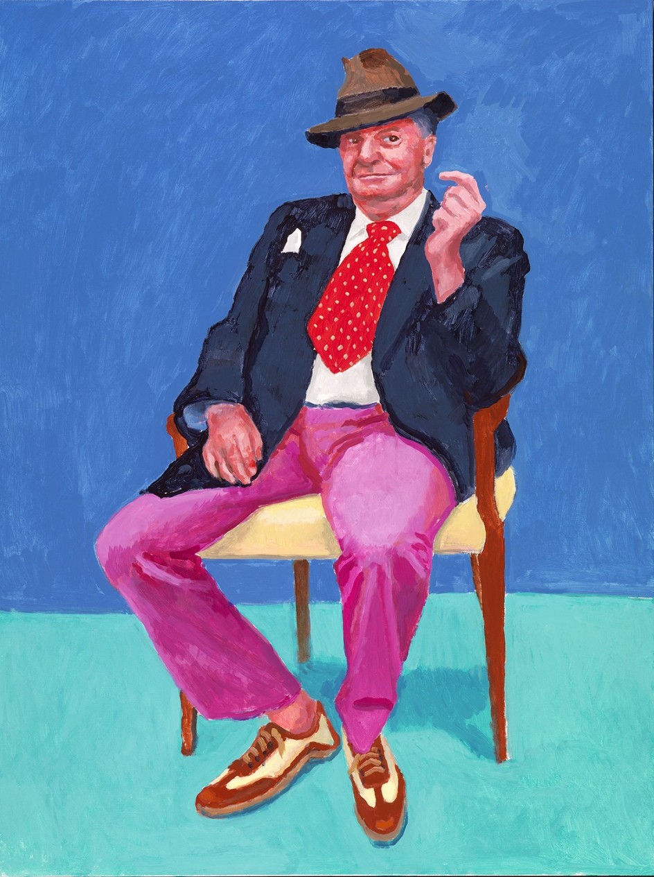
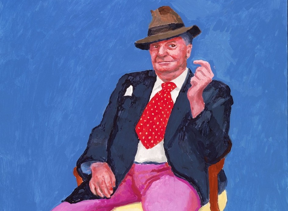
David Hockney ~ Barry Humphries (March 2015)
The three Royal Academy rooms dedicated to 82 portraits and one still life painted over the last two and a half years by an almost 80-year-old David Hockney, are heavy with the sensation one experiences in Tube stations at rush hour: a hum of murmurs, a mass of human bodies and, above all, a buzz of vital energy. Three narrow rooms without natural light or fresh air but with an all too conspicuous barrel-vaulted ceiling that, if one's mind were to wander down to the far end of the last room, create a peculiar dialogue between the public and the characters Hockney introduces us to. A kind of living theatre.
David Hockney ~ Edith Devaney (February 2016)
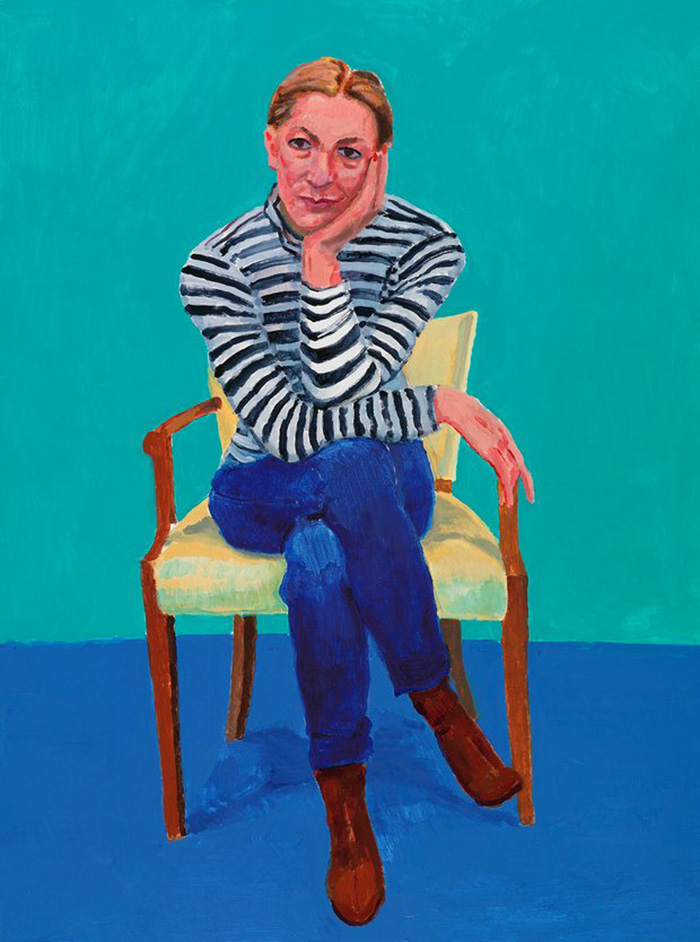
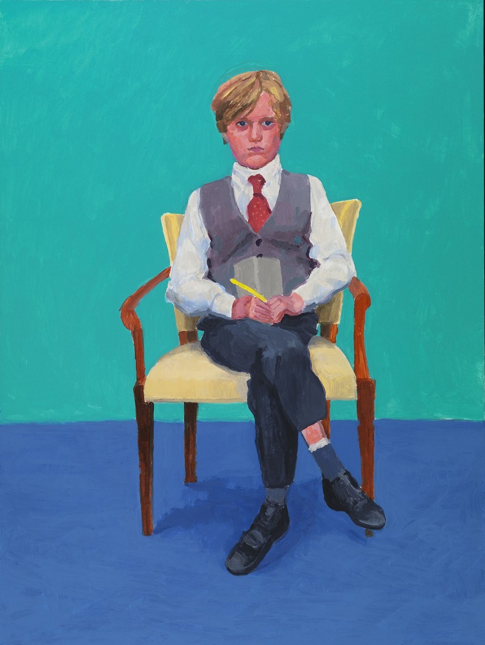
Full-body portraits, hung or rather squeezed tightly next to each other, half a metre from the floor, our eyes at the level of their lips. All of the paintings have the exact same 120 x 90 cm dimensions and the exact same pose time for the sitters of two and a half days or what he calls, using photographic terms, "a 20 hour exposure". And the coordinates are identical. All of the models sit in the same chair, on the same platform, with a blue curtain behind. The only differences are their posture and clothes. Variations on the same theme. The background and the floor are each a block of pure colour, either green of turquoise, with no apparent criteria as to which or why. And the faces, of an otherworldly pink and purple, seem about to explode from the subjects' dangerously high blood pressure! All are from a continent where the light is different. The white light of California. Seen from a certain distance, these gleaming paintings look as if they might have been painted on a plasma screen. Art sometimes emits that light.
Exhibition Room : "82 Portraits and A Still Life" at the Royal Academy of Arts, London
In the spring of 2013, and for the first time in his life, David Hockney (Bradford, 1937) stops painting. It is a time of silence, also, and it lasts for months. Amongst his small, family-like team, no-one is finding it easy to get over the suicide of one of their number, Dominic Elliott, who died after consuming a bottle of bleach during a cocaine and ecstasy binge. Hockney decides to leave England for his house in Los Angeles and it is here, on 13th July 2013, that he paints his faithful assistant, Jean Pierre Gonçalves de Lima (J-P). Against a background and carpet of the saturated, cheery colours that are his trademark, stands a portrait that, nevertheless, portrays the fragility of life and a very deep sorrow. It is, perhaps, a self-portrait by the artist of his own mood and mental state. Sitting on a chair, his feet apart, J-P cradles his head in his hands, elbows on knees, in such a way that we cannot see his face. We imagine he is crying. Consciously or not, Hockney has called to mind Van Gogh's "Sorrowing Old Man", that sad little old man in the same pose, inside the four walls of a wooden cabin, the warmth from his open fire not enough to even take the edge off the cold.
Just the beginning
The portrait of J-P, with a powerful impact all of its own, could have been the only one, isolated in its message. But Hockney's responses are never to be expected and more paintings in the same vein follow. He embarks on a new project. He shifts from the enormous Yorkshire landscapes of his 2012 exhibition, "A Bigger Picture", towards the more intimate. This is the indefatigable Hockney we know. In the era of the selfie, Instagram or photos stolen from real life via tablets and mobiles, the most important painter alive today stops what he was doing to vindicate the two types of painting either neglected or given the kiss of death by Abstract Art at the start of the 20th century: the still life, here a table/fruit composition improvised by Hockney one day his model failed to turn up to an appointment; but especially, the portrait.
In this new series, all his subjects are friends, relatives or collaborators and nothing is commissioned, stand-alone, or meant to be dispersed, sold or given away. They are components of a unique artistic declaration, a profession of faith not just in the portrait but in painting itself. And above and beyond any sociological aspect is the analysis of human psychology embedded in these 82 portraits.
Hockney's taste in literature would tend towards the 'heavy'. At this time, he is immersed in his reading of Balzac's Human Comedy. The sequence of portraits he has in mind becomes a visual study in humanity on a par with Balzac's literary endeavours. Hockney could never be classed as a reader of 'light' books: "Reading for me is not a leisure activity. Or a way to kill time while the world passes you by. I need a project. Something that pushes me to go on. And right now, these portraits are my engine".
David Hockney ~ Rufus Hale (November 2015)
A need to paint
Hockney believes that human beings have an urgent need or pressing desire to paint, from childhood onwards. Painting comes from somewhere deep down within our roots, as do are feelings. He painted because he was fascinated by the world around him. And he still is. His eyes take in open landscapes, water, an impenetrable forest, the people he meets, plants, ..... but his real challenge is being able to translate that and reflect all he sees into the right combination of lines, dots and washes of colour. How can one relay onto canvas a visual experience, for instance a sunrise that encapsulates fleeting time, volume, air, water evaporating or light flickering? How does one capture and compress all of this onto a flat surface? Some time ago, he described this immersion into the creative process thus: "Being able to reduce things down to a line is no easy task". As well as being prodigiously accomplished at drawing, Hockney's thinking and composition come very much from a chromatic angle. He is a huge admirer of Piero de la Francesca and Fra Angelico. Aged 11, he stopped spellbound at a reproduction of The Annunciation by 'the painter of angels' on a corridor wall at his Bradford school. This is not an irrelevant anecdote. There is much of the 15th century Florentine painters in the English Hockney: clear, intense, fresco-like colours; the use of light; even his technique of alternating between acrylic, oil and watercolour which would suggest a quest for effects similar to the clarity afforded by tempera. For this series, Hockney used a new brand of acrylic paints, discovered by J-P, that he thought especially useful: the advantages of watercolour - speed, spontaneity and transparency;combined with those of oil - layer upon layer of paint, allowing him to return to different areas of the canvas as often as was necessary.
Non-verbal language
"Hockney has an inner strength that gives him the impetus to paint" says JP whilst filming a new portrait session. After just 30 minutes of carbon drawing directly onto the canvas there emerge the outlines of the facial features of Rufus, son of Tacita Dean and the only child portrait in the exhibition. Hockney has been almost deaf for a few years now and avoids crowded places but remains a tireless conversationalist. A contagious on, even. His hearing difficulties mean that he scrutinises the models' gestures, expressions and body language meticulously. For this reason, he prefers absolute silence while he works, albeit punctuated with the odd: "Pass me some cadmium yellow ... Give me a neutral grey, please". The colours are mixed in a couple of metal paletteson a trolley behind the easel. That same afternoon, Rufus will return to the platform. Hockney willl have positioned himself , at eye level with the boy, as with all his models, in order not to see their faces from below which would obscure their eyes. Next come the hands, which are make-or-break for Hockney: "I think the skin of the hands gives us the skin of the face. If you get the hands right, the face will always follow". At a certain point, he will step away from the easel to rub the boy's suede shoes, as if to analyse their texture. He will be thinking about the shadow they cast on the rug. And then Hockney will return to his abstracted silence and his erudite travels through the History Of Art to the Orient where shadows don't exist and a painting's tale is told via various points of light. And then he'll return to Rufus Dean's feet. Wasn't it he who said: "A shadow is just the absence of light"?
(Translated from the Spanish by Shauna Devlin)
David Hockney: "82 Portraits and 1 Still-life" at the Royal Academy of Arts, Burlington House, Piccadilly, London
Curator: Edith Devaney
2nd July ~ 2nd October 2016
- La comedia humana segun David Hockney - - Página principal: Alejandra de Argos -
- Details
- Written by Marina Valcárcel
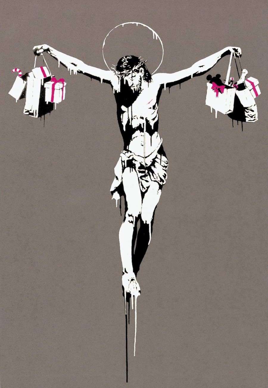
We are here for what could arguably be called the retrospective of an unknown artist. The Terzo Pilastro Foundation in Rome is showing the largest exhibition to date of a certain Banksy, the faceless star of Street Art. A pseudonym for a rebel artist whose incisive, sometimes ironic and irreverent work, questions and denounces the political and social mores of our time. A short distance away from the Cipolla Palace where the exhibition is being held, in another palace on the Vía del Corso, hangs Velázquez's "Portrait Of Pope Innocent X"; we can only imagine wryly his thoughts, more amazed than ever, watching the endless queues wind past the canvas: 15,000 entrance tickets sold in the first fortnight. What would Velázquez think of this graffiti artist who dared to depict a Christ similar to his own but whose outstretched hands, instead of being nailed to the cross, are holding aloft shopping bags stuffed full of gifts, sweets and champagne?
|
Author: Marina Valcárcel
Art Historian
|
|
We are here for what could arguably be called the retrospective of an unknown artist. The Terzo Pilastro Foundation in Rome is showing the largest exhibition to date of a certain Banksy, the faceless star of Street Art. A pseudonym for a rebel artist whose incisive, sometimes ironic and irreverent work, questions and denounces the political and social mores of our time. A short distance away from the Cipolla Palace where the exhibition is being held, in another palace on the Vía del Corso, hangs Velázquez's "Portrait Of Pope Innocent X"; we can only imagine wryly his thoughts, more amazed than ever, watching the endless queues wind past the canvas: 15,000 entrance tickets sold in the first fortnight. What would Velázquez think of this graffiti artist who dared to depict a Christ similar to his own but whose outstretched hands, instead of being nailed to the cross, are holding aloft shopping bags stuffed full of gifts, sweets and champagne?
"War, Capitalism And Liberty" is the title of this exhibit that encapsulates three of the main concerns tackled in the discourse of this instigator of a brand new type of engagement, one that is more astute, more intelligent and double-edged, all essential qualities in today's world. His anti-materialist, anti-capitalist and anti-establishment skits have spread like wildfire, particularly amongst the young. Banksy is not just a graffiti artist but a thinker. His campaign of action, far-reaching and sustained, would be on a par with the best Secret Service strategies. Between 1992 and1994 his work, but not he, was to be found in each and every one of the places his audience looked for him.
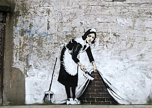
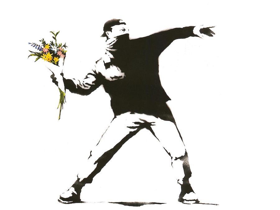
First gallery, first wow factor: in the same way that his "Love Is In The Air" (Flower Thrower), that emotive graffiti picture of a 21st century "Discobulus of Myron", in which a young boy in full flight, his face hidden under a handkerchief and baseball cap on backwards, throws what one would expect to be a molotov cocktail but is, in fact, a bunch of flowers ….. the exhibition kicks off with a similar punch. It's a message from Banksy that could just as well be a gas canister: or a petrol bomb: "I like to think that I have sufficient courage to reclaim, anonymously, in a Western democracy, the things that nobody believes in anymore ~ peace, justice and liberty." And after this quote, highlighted against a jet black background, come 150 of his works, dated 1998 to 2011 and all belonging to private collections, spread over ten rooms. The curators have pointed out, in no uncertain terms, that Banksy had absolutely no involvement in the organising of this exhibition.
According to popular myth, Banksy, born in Bristol, perhaps in 1974, would be around 40 and recently married to a Labour MP. He is, therefore, a good 8 or 10 years younger than those other two revolutionaries on the British art scene: Damien Hirst and Tracey Emin. His anonymity is arguably the key to his success. But there's a big question raised by this exhibition, already asked and unanswered since his 2009 Bristol show. Will Banksy move from being the guy who painted on inner-city street walls in provincial UK cities, to being a painter of canvasses that hang in grand European museums or in galleries frequented by the likes of Tom Cruise, Cristina Aguilera and Angelina Jolie, all willing to pay hundreds of thousands of dollars for them? Arcoris Andipa, a curator of the exhibition and the Greek gallery owner settled in London who has sold more of Banksy's work than anyone else, claims: "His success lies in the intelligence of the messages in his work."
Perhaps before Banksy there was little possibility of graffiti being accepted as art. Even so, in today's world, the limitation lines are blurred. One could wonder at the dearth of books on the subject of Urban Art compared with the proliferation of images, usually without any accompanying text, posted on artists' websites and social media. For this reason, let's look briefly at the two tendencies in Street Art: graffiti and post-graffiti. Graffiti, first seen in Philadelphia in 1959, is a popular tradition throughout the Western world whereby street gangs mark out their territory and achieve fame by spraying or writing their names or other slogans on walls or any available surface throughout the city with aerosol paints and felt-tip pens. In 1970's New York, this extended to railway carriages in the subway. Keith Haring describes it thus: "I arrived in New York at a time when the most beautiful paintings on display in the city were on train wheels. Paintings that travelled to you rather than the other way round."
Postgraffiti, on the other hand, to which artists from Basquiat to Banksy belonged and started in New York in the 1980's, is graffic and very rarely textual. They are images that seek to engage passers-by in a dialogue between artist and spectator, a sort of intimate connection in a public space. They invite us to participate, to marvel on every street corner or wall at the message left, the critique drawn, the authorship signed. They want us to recognise their style and become fans of it. They want to leave their footprint. Postgraffiti emerged from the confluence of academic art, principally pop, and various forms of urban culture, namely graffiti proper, punk rock and skate. It could be defined as a self-promotion campaign with no financial gain to be had and in which the artist has total freedom. Graffiti artists fit a very narrow profile: always young, always men, the majority of them design or fine art students who substitute stencils, stickers or free-hand painting for aerosol sprays. Their uniform is the 'hoodie' - to hide their identities - and trainers, to get away quickly. They all grew up in the internet age and this is their means and method of injecting their art into the veins of the world.
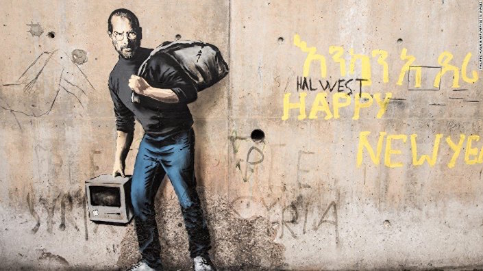
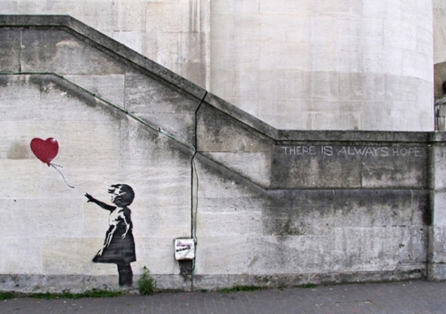
Every piece of art looks strangely out of place if we remove it from the place it was originally destined for. We are in the city of Caravaggio and contemplating his "Calling Of St Matthew" which does not look the same, up close in the gentle light of the Contarelli Chapel, as it would on a cold museum wall. And it's notable that this effect is multiplied exponentially with Banksy. In the Cipolla Palace, his pictures and lithographs lack the force that a portion of wall "borrowed" from the street would afford them. They have little in common with the emotional response to the little girl trying to fly out of the Gaza Strip on a fistful of balloons or the late Steve Jobs painted as a Syrian immigrant in Calais. Part of the charm of urban art is its transitory nature, the feeling that its lifespan is dictated by vandals or the police. So here, neatly ordered and reproduced in series, the magic of its fragility, its creation in the night-time, in the light of a streetlamp and the instability of a stroll are all but lost. This was the internal debate Banksy pushed us to. Graffiti is a form of guerrilla warfare. It's a way of stealing power, territory and glory from a more heavily-armed enemy. Banksy once called it "a form of revenge". All of this is lost beneath the protective domes of a palace in Rome.
It is estimated that there are more than 140 places around the world where Banksy carried out his work. This exhibition allows us a unique journey: to unravel some of the enigma of Banksy without having to trek all the way from Israel to New Orleans.
War, Capitalism And Liberty
Terzo Pilastro Foundation, Cipolla Palace, Vía del Corso 320, Rome
Curators: Stefano Antonelli, Francesca Mezzano and Arcoris Andipa Until 4 September 2016
See also:
(Translated from the Spanish by Shauna Devlin)
- Banksy: From the Backstreets to a Roman Palace - - Alejandra de Argos -
- Details
- Written by Cristina Ojea Calahorra
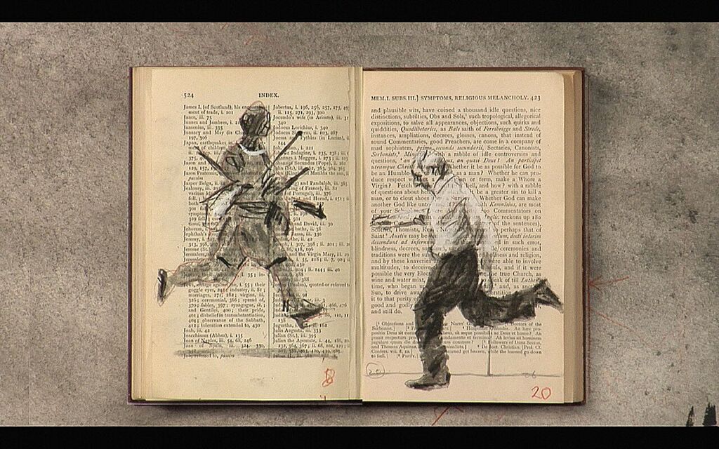
Whenever we come across a line, what we see might well be some kind of barrier or boundary dividing one space from one or more others. However, if we think beyond it as that enough to breach it, a whole world of possibilities opens up before us. When we walk the line, the boundaries disappear and another unexplored, unexpected path opens up. Walk The Line: drawing through in contemporary art is a stroll through a collection of artworks dedicated to the delineation of a segment, its texture and its trail. If a line indeed symbolizes the most primitive of artistic expressions, the suite of works exhibited here takes up that original remit: drawing as the essential principal of artwork.
William Kentridge: Tango For Page Turning, 2012-2013. Single Chanel HD video. Picture courtesy of Galleria Lia Rumma Milan/Naples.
Irma Blank. Radical Writings, Vademecum VI, 1994. Ballpoint pen on paper. Courtesy of: Gregor Podnar, Berlin / P420, Bolonia.
José Antonio Suárez Londoño. Untitled (1), 2015. Mixed media on paper. Courtesy of Bernal Espacio Gallery, Madrid.
{vimeo}153658531|600|350{/vimeo}
Galeria Bernal Espacio. 10 - 29 de February 2016.
(Translated from the Spanish by Shauna Devlin)
- A Question Of Dimension. Contemporary Drawing - - Homepage: Alejandra de Argos -
- Details
- Written by Marina Valcárcel

The Thyssen-Bornemisza Museum's gallery walls are freshly painted a golden shade of ochre to inaugurate its new exhibition, Zurbarán: A New Perspective (Madrid 9 June - 13 Sept 2015). "Seville's walls, circa 1630, were often of that colour. And, what's more, I think it goes well with the artist's golds and blacks." explains Guillermo Solana, the museum's director and our guide for this tour. A 19th century German philosopher once said that every work of art is "essentially a question, an appeal to the heart that answers it back."and so what we'd like a response to first is: What do Francisco de Zurbarán's paintings mean? What's behind them, those Dominican friars in their white habits, the saints, the martyrs and the vases of flowers? "Zurbarán is, above all else, a painter of the tactile world of volumes and textures." explains Solana.
|
Author: Marina Valcárcel
Art Historian
|
|
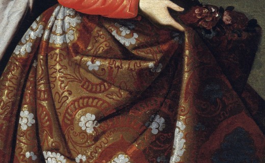
Detail of St Cassilda's robe. Francisco de Zurbarán (c. 1630-1635)
A conversation with Guillermo Solana
The Thyssen-Bornemisza Museum's gallery walls are freshly painted a golden shade of ochre to inaugurate its new exhibition, Zurbarán: A New Perspective (Madrid 9 June - 13 Sept 2015). "Seville's walls, circa 1630, were often of that colour. And, what's more, I think it goes well with the artist's golds and blacks." explains Guillermo Solana, the museum's director and our guide for this tour. A 19th century German philosopher once said that every work of art is "essentially a question, an appeal to the heart that answers it back."and so what we'd like a response to first is: What do Francisco de Zurbarán's paintings mean? What's behind them, those Dominican friars in their white habits, the saints, the martyrs and the vases of flowers? "Zurbarán is, above all else, a painter of the tactile world of volumes and textures." explains Solana.
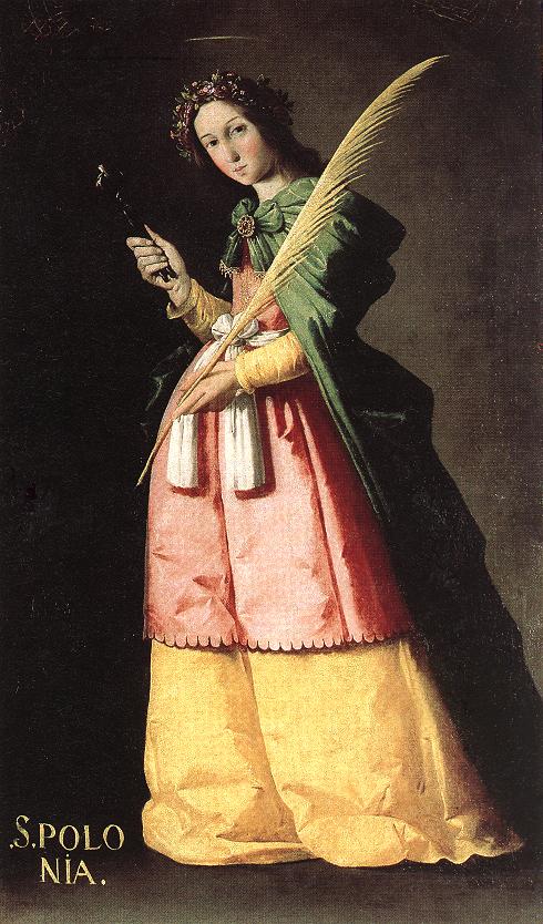
St Apollonia. Francisco de Zurbarán (1636)
St Apollonia. Francisco de Zurbarán (1636)
The entrance to the exhibition is hung with a large map of Seville during the first half of the XVII century. Zurbarán was born in 1598, the same year as the death of Philip II of Spain, and lived until 1664, one year before the death of Philip IV. It's numerical magic. Two great kings who each in their own right made decisive acquisitions and contributions to the royal collections.
Seville, at the onset of the 1600's, was a city of wealth and prosperity, full of convents, parishes, hospitals, an immense cathedral nearing completion ... but also overwhelmed by the heavy burden of the Counter-Reformation, Trento and the havoc wreaked by the plague. "Zurbarán was the painter who best understood the male monastic remit. This kind of painting was too severe and harsh for the taste of female congregations." Zurbarán was the son of a cloth merchant and he replicated those cloths in paint in each of his pictures: their heaviness, the thick folds of the woollen habits, the coarse threads of tablecloths, the stiffly woven Hessian in the Franciscans' sackcloth habits, the green and strawberry-red silk of St Apollonia's gown or the sumptuous brocades worn by other saints, in imitation of the fantastical costumes and ideas being worn on theatre stages or arriving from Venice.
But why then, if this is the case, does Zurbarán's oeuvre focus almost exclusively on painting austere monks and becoming the painter of "monastic life"? Was it for purely commercial reasons? What part did the Counter-Reformation and Trento play in his choices? Solana answers: "Zurbarán understands the key to clarity and post-Tridentate legibility. Trento's instructions were that the language of painting had to be clear, didactic and as far removed from the complications of mannerism as possible. And Zurbarán is indeed 'legible', even in the way he paints chiaroscuro, silhouetting his figures against the light. He is utterly convincing in his expressionism which suits the language of the Counter-Reformation perfectly."
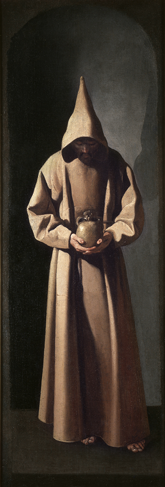
Saint Francis contemplating a skull. Francisco de Zurbarán (1633-1635)
The exhibition comprises 63 of Zurbarán's works, mainly large format, divided over seven rooms. We stop in front of Saint Ambrose, a fine example of what's at the very heart of Zurbarán's painting. Here, the statuesque figure of the Bishop of Milan is outlined by a light coming from the darkness on the left and striking his cape of red and gold damasks and also highlighting a studded mitre of ochre felt. These are the elements that really confer strength onto the picture, far beyond any facial expression, which would have been a novelty at the time. If we think that for El Greco, it was the eyes, the hands and the swirls of angels who conveyed expression and meaning, for Zurbarán it was the "inanimate agents" who speak to us. Solana explains in more detail: "One of the things about Zurbarán that must have fascinated modern artists, such as Manet in Paris for instance, is this egalitarianism in the treatment of figures and objects, in itself one long chapter in 19th century art criticism. One of the things that critics held against Manet and his contemporaries was that they treated the human figure like a thing and things like humans. Traditional academic hierarchical norms were broken down."
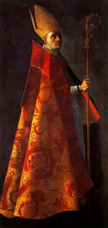
Saint Ambrose. Francisco de Zurbarán (1626-1627)
Seville and the power of painting
17th century Seville was, in addition, an important artistic hub with the newly-arrived influence of Caravaggio and Dürer along with German and Dutch engravers serving as the inspiration for many of Zurbarán's scenes and iconographies. And then, above all else, there was Velázquez. In Seville, both painters knew each other well and out of their friendship came Zurbarán's move to Madrid to contribute his Ten Labours of Hercules series to the Hall Of Realms of King Philip IV's Buen Retiro Palace.
We now turn to discussion of the marked differences between Velázquez and Zurbarán and the different languages used by Spain's, arguably, top two Golden Age painters to communicate with their audience. Art Historian Jonathan Brown describes how, while Velázquez viewed his époque through a microscope and portrayed it this way in his paintings, Zurbarán reproduced his world, in his time, as a mirror. In his Portrait of Innocent X, everything is pure expression; the pope's eyes speak, as do Velázquez' brushstrokes. By way of contrast, Zurbarán's Saint Bruno and Pope Urban II are radically different.
Solana concedes but elaborates: "I agree. But perhaps that makes Zurbarán a more modern painter. The Manet or post-Manet schools are less psychological, less interested in expression. Manet's best portraits do not capture or reveal the soul of the sitter. His portraits are, rather, still lifes. Cézanne required his models to pose as if they were apples being painted. The importance of psychological penetration so evident in Velázquez is not present at all in Zurbarán. He was interested in something else entirely."
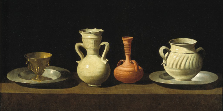
Still life with pottery and cup. Francisco de Zurbarán (c.1650-1655)
From Zurbarán and Caravaggio to Cézanne and De Chirico.
Zurbarán models with light: his silent monks come out of the dark and dazzle in white. St Serapion is, perhaps, the jewel in the crown of the exhibition. The Mercedarian friar hangs from the ropes that bind his wrists in a quasi-crucified pose. We are familiar with his story of martyrdom, the Jesuits' fourth vote or 'Blood Oath', the acceptance of death, the torment, the ecstasy. Zurbarán hides any traces of the saint's excruciating torture and evisceration under an unblemished habit and there is not the least sign of his violent death to be seen here.
Solana then points out what it is we should be noticing: take, for instance, the Mercedarian scarlet cross emblem against the white chasuble, in the dead centre of the painting. We look around, only to see that same emblem, like a blood stain, in the exact same spot in every other Mercedarian painting in the room.
So we consider for a moment Zurbarán's mode of expression - so subdued, so muted and so inconspicuous. And the difference between his and an Italian contemporary's mode of expression. With Caravaggio, there is a frenzy of gestures, of open arms that seem to reach out of the frame, of hands floating mid-air, of human levitations, of oblique lines and daring composition. There is commotion, action and incident in his The Supper at Emmaus or The Entombment of Christ.
Zurbarán is much more static. Again we consult our expert of the day and Solana indulges us with another master class: "Caravaggio, as a painter, is full of violence, sometimes very intense, sometimes contained but always there, latent. He, as a painter, is full of the instantaneous. There is an explosiveness. In The Calling of St Matthew this is patent. It is replete with what Italians called "Il motto", namely, expression: the body language, a fleeting look on the subject's face ... all givens in early Italian Baroque. Zurbarán's sensitivity is different, calmer, more mystic and less tragic. For this reason, it connects so well with a certain type of 20th century art that avoids excessive gesticulation. That type of art Bernard Berenson dubbed "ineloquent", deliberately and stubbornly silent, Italian metaphysical art. De Chirico, for instance. You mentioned Morandi, too, and rightly so. And then there were all those inter-war painters and their Magic Realism or New Objectivity. To my mind, the ones who connect most closely with Zurbarán are those artists who also suspend their expression for the duration of the silence. From Derain to certain German artists, Christian Schad, Gutiérrez Solana even."
Our next request is for an explanation as to the colour black: that deepest, darkest and most Spanish of blacks. And to understand, also, the way Zurbarán painted shadow. Solana sums it up with: "I believe painters can be divided into those who paint shadows in black and those who don't. From as far back as Delacroix, and then later with Impressionism, we've been told that shadows must be in colour. The great tradition of the colourists was to create shadows that were luminous, transparent, of varying hues. And then there were the painters who said: "Absolutely not. Black shadows, black paint." which probably does produce less sensory charm but also, at times, much more expressive forcefulness. And all of this has a definite link to Zurbarán".
And with this contradiction of black versus white, we leave Zurbarán who, for us, will forever be the painter of the white spectrum. He of the rough peel on quinces and the smoothness of stone, he of the heavy cassocks, of bleak Extremadura landscapes, of what is concrete, of solid volumes, of quiet times and quiet things, of an insurmountable silence that can often lead to a feeling of uneasiness. An exceptional dimension to painting but also one that Cézanne's early still-lifes can boast, or those of Juan Gris and, later still, those of Morandi. But that is another story for another day.
Ignacio Zuloaga, on purchasing one of his paintings, once defined Zurbarán in a letter to an artist friend as: "The Spanish painter. Whereas Velázquez is cosmopolitan and universal, Zurbarán could only ever be Spanish."
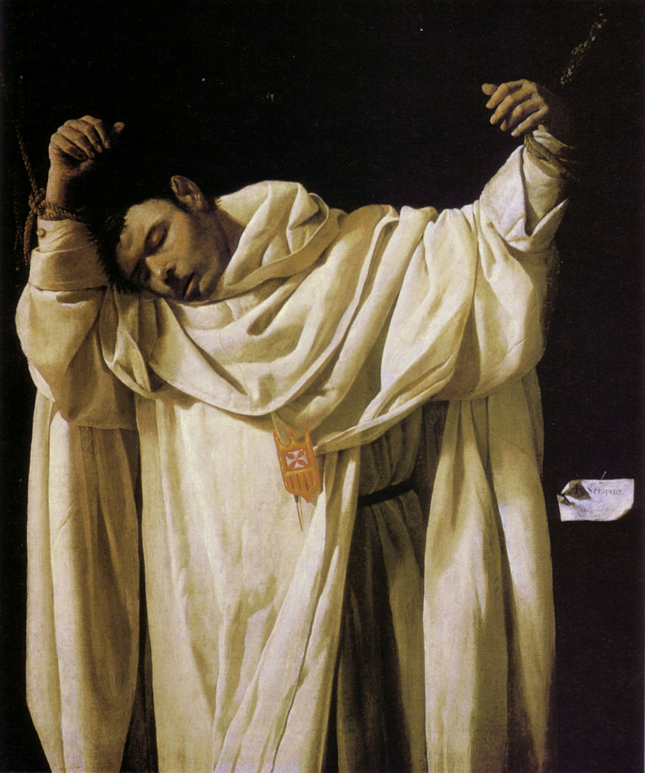
St Serapion. Francisco de Zurbarán (1628)
(Translated from the Spanish by Shauna Devlin)
- Details
- Written by Marina Valcárcel
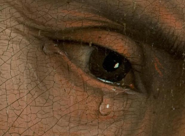
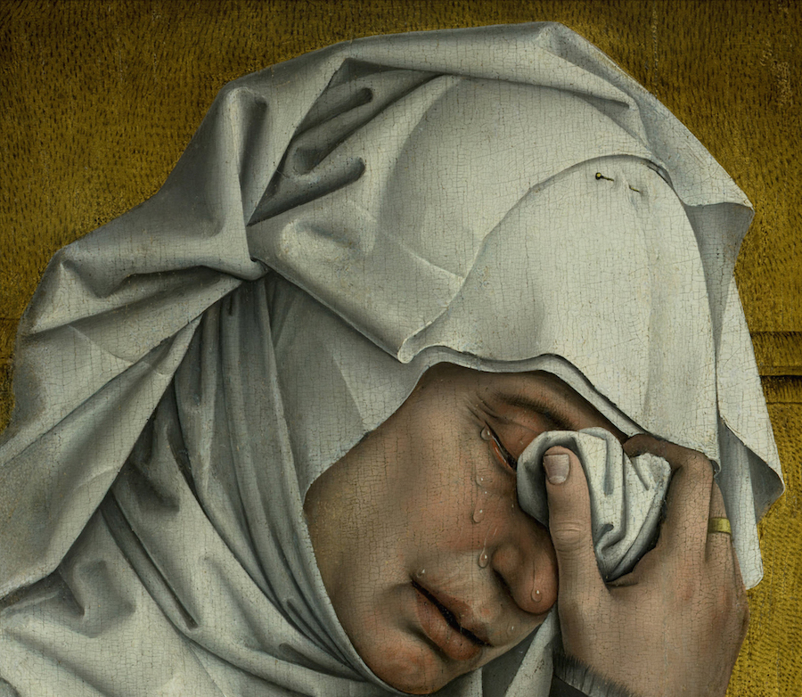
Detail: St John’s eye. The Deposition of Christ. Rogier Van der Weyden.
It’s 1435 and Rogier van der Weyden (1399/1400?-1464) leaves his French birthplace of Tournai, where he had been Robert Campin’s apprentice, to embark on a new life in Brussels along with his Belgian wife and young son Pierre. Here he would paint The Deposition of Christ - now one of the crown jewels in Madrid’s Prado Museum. It is thrilling to see this exquisite painting flanked by the artist’s other masterpieces, in one place for the first and perhaps only time ever, namely the Durán Madonna, the Seven Sacraments triptych from Antwerp and the extraordinary and recently restored Escorial/Scheut Crucifixion.
Flanders: the role of the bourgeoisie in art
Van der Weyden knew that any artistic debate would be settled there in Brussels, a city wallowing in the economic prosperity occasioned by certain dynastic alliances and political stability. Painters, sculptors, illuminators, goldsmiths, tapestry weavers flock to Brussels for its commercial opportunities and potential clientele. The trade guilds start to move and shake within society. Banking and industry are the new sources of wealth, making material comforts and sumptuous lifestyles a reality. The new middle classes are now the catalysts for revolution within both society and artistic parameters. In the “Flemish School” of art they patronise, the object takes centre stage and realism mirrors their enrichment in microscopic detail. The middle classes now require art to reflect their way of life and their high standard of living. Paintings replicate the minutiae of their everyday lives. In the Northern European religious remit, The Annunciation and The Crucifixion are situated inside their very own homes, their gardens, in amongst their furniture, mirrors, pet dogs and shoes, between birds and clouds … and every pearl, every vase and every fireside armchair becomes a chronicle or contains a message. Also, the growing cult and holy grail of fabric perfection: how it drapes and folds; how its colour, texture and quality indicate the wearers’ social status; how textile manufacturing is having its heyday in Flanders.
Shortly after arriving in Brussels and at a pivotal time in his career, Van Der Weyden receives a commission to paint an altar triptych. And it is this work that would mark an end to all that had gone before in Flemish art. ”The best painting in the world”, concluded King Philip II of Spain’s advisors, a sentiment echoed by both their contemporaries and successive generations of experts alike.
Van der Weyden and the Van Eyck brothers constituted two very different camps in Flemish painting. The latter’s mastery of gothic miniaturism produced their meticulous rendering of every detail and their illusory depiction of perspective whilst any emotions, and never any untoward ones, played only a supporting role. Van der Weyden, by contrast, although also a consummate detailist, would be the most ‘dramatic’ of all the Flemish artists. He would outshine all-comers in his composition and his creation of the illusion of movement through linear angling, He fully intends this picture to be a masterpiece showcasing his idea of what painting is and also a new beauty ideal based on the transmission of feelings. The moving beauty of seeing others ‘moved’. All that was then known about painting comes together here in perfect, seemingly alchemic, fusion to flesh and stone, rest and motion, composition and expression, rhythm and geometry. It is also the confirmation of the supremacy of oil as a medium to render the biblical message of Christ’s passion through human compassion, realism and empathy with the emotions of the characters depicted.
Detail: Maria Salomé. The Deposition of Christ. Rogier Van der Weyden.
The journey to Madrid
It was the Grand Guild of Archers, the oldest and wealthiest of the four in 15th century Louvain, who commissioned Van Der Weyden’s work for their chapel - Our Lady Without The Walls. As a homage to and marker of their patronage, there are two small crossbows hung on the spandrels of the tracery in the top lateral corners of the painting.
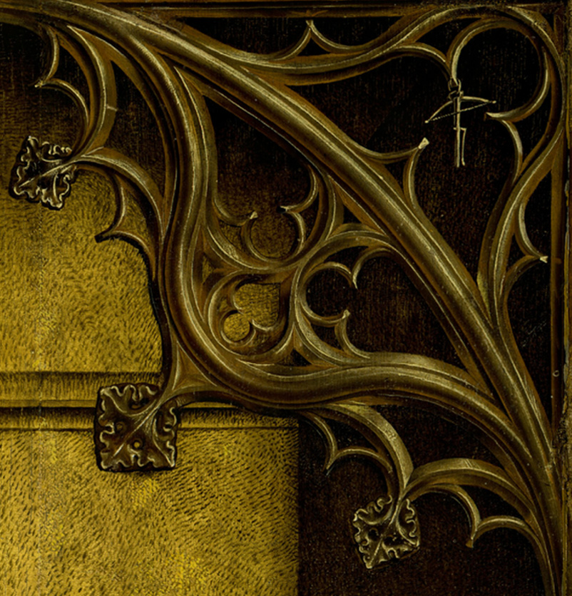
Detail: Tracery with hanging crossbow. The Deposition of Christ. Rogier Van der Weyden.
In 1548, the painting was acquired by the Emperor Charles’ sister, Queen Mary of Hungary, in exchange for a copy painted by Michiel Coxcie and an organ worth 1,500 florins. Mary, also governor regent of the Netherlands, hung the painting in the chapel of her castle at Binche with is fine collection of the very best paintings and tapestries, its frescoed walls and ceilings and its jasper fireplaces, all handpicked by the queen herself. It was seen and admired there in 1549 by her nephew, prince Philip of Spain, and his entourage. By 1556, the painting had been gifted to him, now King Philip II, and was hung first in the El Pardo palace and later in the sacristy of the El Escorial monastery fortress alongside Van Der Weyden’s Scheut Crucifixion. In 1939, it was moved to the Prado Museum where it remains to this day.
Baltic Oak and Flemish Oils
Recently arrived with his wife and small son Pierre, Van Der Weyden has a large house in the silversmith neighbourhood of Brussels out of which he starts work on The Deposition, not as yet having a separate workshop of his own. Given the ongoing influence of traditional altarpieces, Van der Weyden and his two assistants carefully select the boards of wood to be used, rejecting any with knots or imperfections and positioning them vertically in the direction of the grain. The support for the painting would eventually comprise eleven panels of the best Baltic oak.
Back in his studio, the painstaking task of priming the assembled panels begins: one layer of stucco and gelatine size, laboriously hand polished to give an impeccably white, marble-like surface. It is by this process that oils of that era achieved such luminosity: transparent upper layers of colour traversed by the white base underneath them. Often the top coat applied was of a lead-filled white with enormous reflective qualities.
Detail: The clothing of Nicodemus and Mary Magdalene. The Deposition of Christ. Rogier Van der Weyden.
Van der Weyden paints with a palette and brushes; it’s the moment of revolution in oil in Flanders. This technique has been known and used since antiquity and up the 15th century when the Van Eyck brothers perfected it by mixing pigment with a linseed and walnut oil substance. They also added a quick-dry agent that also enhanced the oils’ fluidity, thereby solving the two great problem defects in the technique up until that time. One of the characteristics of oil, compared with tempera’s opaque egg and pigment combination, was its fabulous transparency that afforded a hitherto unknown depth. Van der Weyden exhaustively explores the possibilities of the technique: veiling and superimposing colours to reveal objects as never before; a tear’s reflection, shoe buckles set in the shiny surface of a stone. VDR also sought out the highest quality pigments for this piece. For this reason the painting emits a lustre normally only seen in varnish or enamel. From a technical point of view, The Deposition is one of the most elaborate and well-preserved works of its day. Rarely has a colouring been seen so vivid as that of the Virgin Mary’s apparel, resembling rather a flame of blue fire than a coat of paint. Transparency favours colour saturation, which in this case was achieved with a base layer of greenish blue superimposed with two layers of ultramarine.
Detail: The Virgin Mary’s clothing. The Deposition of Christ. Rogier Van der Weyden.
Dramatis Personae of the tragedy
Much has been written about the sensation one experiences on viewing this painting from a certain distance. It’s theatrical staging, as if the curtain had just been raised in a small village theatre of the time. The tableau vivant that would be so familiar to the imaginations of people of that era, accustomed as they were to seeing representations of Eucharistic plays.
The size of the figures, and, more importantly, their positioning in a composition where time seems to be standing still. They are characters immersed in the drama taking place around them, shown in their gestures and expressions, and must have been in total motion before the curtain went up. Arms opening, hands joining, crossing and falling. The ladder cutting through the cross, the pliers to remove the crucifixion nails, the Virgin Mary in mid-fall to the ground, Christ’s body and its weight against Joseph’s chest. The behaviour of the characters, the heightened expressions, the eyes, reddened but still intently focused, mouths half-open, the theatricality and the central role of emotion and its expression during the whole gamut of stages of grief: anxiety, mourning, weeping, self-restraint, tears, fainting. Nothing crass or gruesome or sensational has any place in this painting.
Christ’s body is treated with supreme delicacy. It is the otherwise unblemished body of a young Jewish man, the only pathos to be found is in his petrified facial expression and the marble-like colour of death on his skin.
There are ten in this cast of characters, six on the left and four on the right. They make up a geometric design of straight, horizontal and oblique lines, bracketed and closed off at the sides by the curved bodies of Mary Magdalene and St John. The rhythm of the painting, undulating, uneven, irregular, full of puzzles to be solved, of eyes or lines of vision or patterns telling us where we should be looking is one of the painting’s fascinations for us.
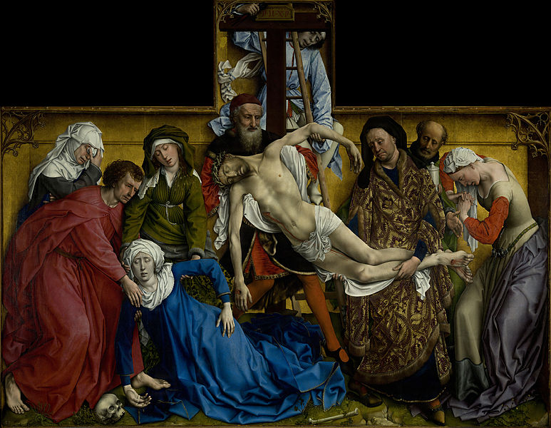
The Deposition of Christ. Rogier Van der Weyden.
And there is much of the sculptural about the painting. Van der Weyden, who survived the Black Death raging in his native Tournai in 1400, was heavily influenced by the funereal statues and carvings he saw growing up. It is also supposed that his apprenticeship with Robert Campin began with instruction in sculpture and this early influence never left him.
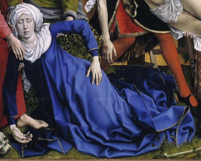
Two principal forms traverse the scene diagonally: that of Christ having been lowered down from the cross and that of the Virgin Mary who has just fainted. The shape of these two bodies as they descend in a synchronised echo of each other, one beside but below the other, is that of two crossbows. In perhaps another nod to his patrons, the arms of Christ and his mother each form their own semi-circular arc whilst the trunks of their bodies form the straight stock of the weapon.
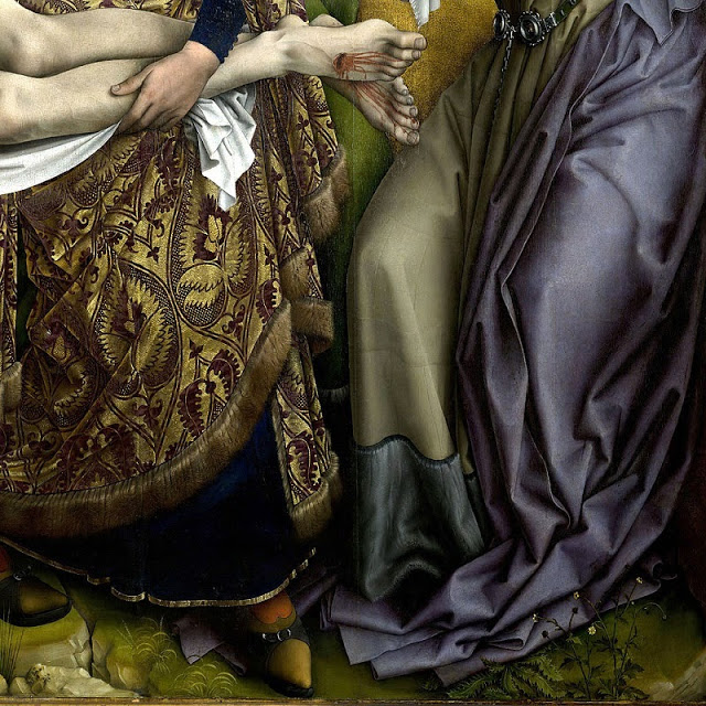
To the right of Christ and dressed in an opulent coat of purple and gold damask, Nicodemus’ fixed gaze takes us across the oval of the painting from above. Along the radius emanating from Christ’s right hand, it takes us over Christ’s loincloth to one of the most iconic parts of the painting: the hands of the Virgin Mary and her son’s falling limply within centimetres of each other and about to touch. The diagonal line stops abruptly here and we find ourselves contemplating a few square inches of paint that make this one of the greatest masterpieces in the history of art. One hand is punctured by an open wound, the blood congealed into rolling tear shapes, against a backdrop of green velvety damask and red stockings; the other is alone, its fingers softly and slightly spread against a backdrop of lapis lazuli. A genius excerpt from a painting that transcends time itself.
Detail: The hands of the Virgin Mary and of Christ. The Deposition of Christ. Rogier Van der Weyden.
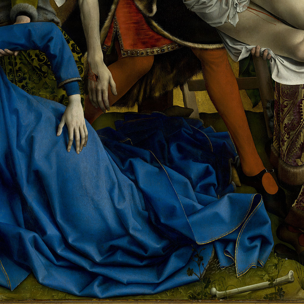
But the story continued and so does the diagonal line, as far as the feet of St John: “Woman, behold your son …” (John 19, 25 – 27) and Mary’s other hand that lies inert, upturned and grey on the ground next to the skull of the first man God ever created, Adam.
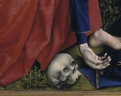
Detail: The right hand of the Virgin Mary and the skull of Adam. The Deposition of Christ. Rogier Van der Weyden.
This diagonal line that traverses the painting, like a ray of lightening, delineates the message that Man’s redemption after Adam and Eve’s original sin is here in the death and resurrection of Jesus. And in the compassion of Mary, her co-passion, her sharing in and of her son’s suffering. For us all.
Christ’s body here shows no signs of the flagellation he endured before they crucified him. All we see are the nail wounds to his hands and feet and where he was stabbed in his side. This latter wound between his ribs is palpably deep. The crown on His head is a hideous braid of greyish green rosebush thorns still painfully driven into his forehead and left ear.
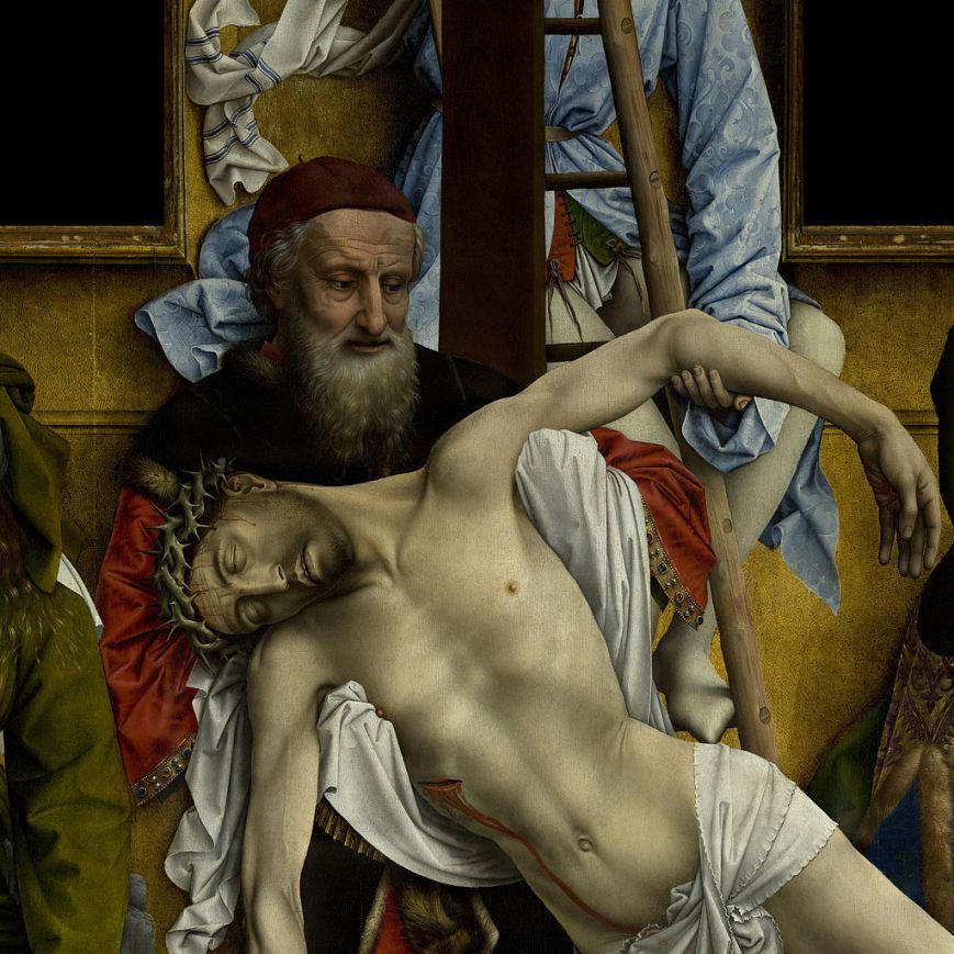
Detail: The body of Christ. The Deposition of Christ. Rogier Van der Weyden.
Christ’s neck twists to the side, disjointed, lifeless. His mouth is half open and we can see the bottom edge of his top teeth. As a general rule, in scenes of this type, Christ is fully bearded. Here we see only stubble, perhaps what has grown over the three days it took for him to die on the cross. The blood from his pierced side had dripped down as far as his inner thigh under the loincloth, but cleanly, without staining it. Like a red ribbon seen through sheer muslin.
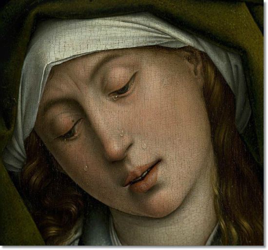
Detail: The Virgin Mary. The Deposition of Christ. Rogier Van der Weyden.
The Virgin Mary’s head and décolleté are covered by the exact same white frilly-edged fabric as Christ’s loincloth and Mary Magdalene’s scarf. This white contrasts sharply with the lilac of her lips, the washed-out pink of her eyes as they roll backwards and the pallor of her skin after she swoons. Five tears trickle down her face, one about to drop off her pale chin.
She is dressed in a tunic. The cloak that fell to the ground as she fainted is edged with gold thread and covers her elongated legs and all but the tips of her splayed shoes. This blue stain flooding the centre of the painting flows backwards towards the ladder and the cross like a river of soft waves.
Joseph of Arimathea, the rich man in whose tomb Jesus’ body would be laid, wears a tunic of purple black, edged with fur that, like his beard, has been painstakingly applied, one hair at a time, individually. Van Der Weyden’s lushly beautiful technique carries over into the red tabard, its border beset with pearls, rubies and sapphires, each a precious jewel in itself. Above Joseph’s head is the cross, in the form of Tau and of such tiny, unreal proportions that Christ’s extended arms could never have been nailed there.
Leaning on the crossbeam and literally squeezed inside the frame, the young manservant of Nicodemus or Joseph holds in his right hand the pliers that have only just extracted the nails from Christ’s palms.
To the left of the Virgin Mary are three figures: Maria Salomé, a young woman dressed in green, and supporting the Virgin Mary with her hands. Van der Weyden paints her face as almost identical to that of the Virgin Mary beneath. Are they perhaps sisters? Maria Salomé’s head and part of her body are covered by heavy, olive-green velvet, tied under her breasts with chord and tucked under her right elbow, allowing us to see the fur lining, matching the collar and cuffs, and her under dress of the same tone but this time shining and embossed with patterns and motifs.
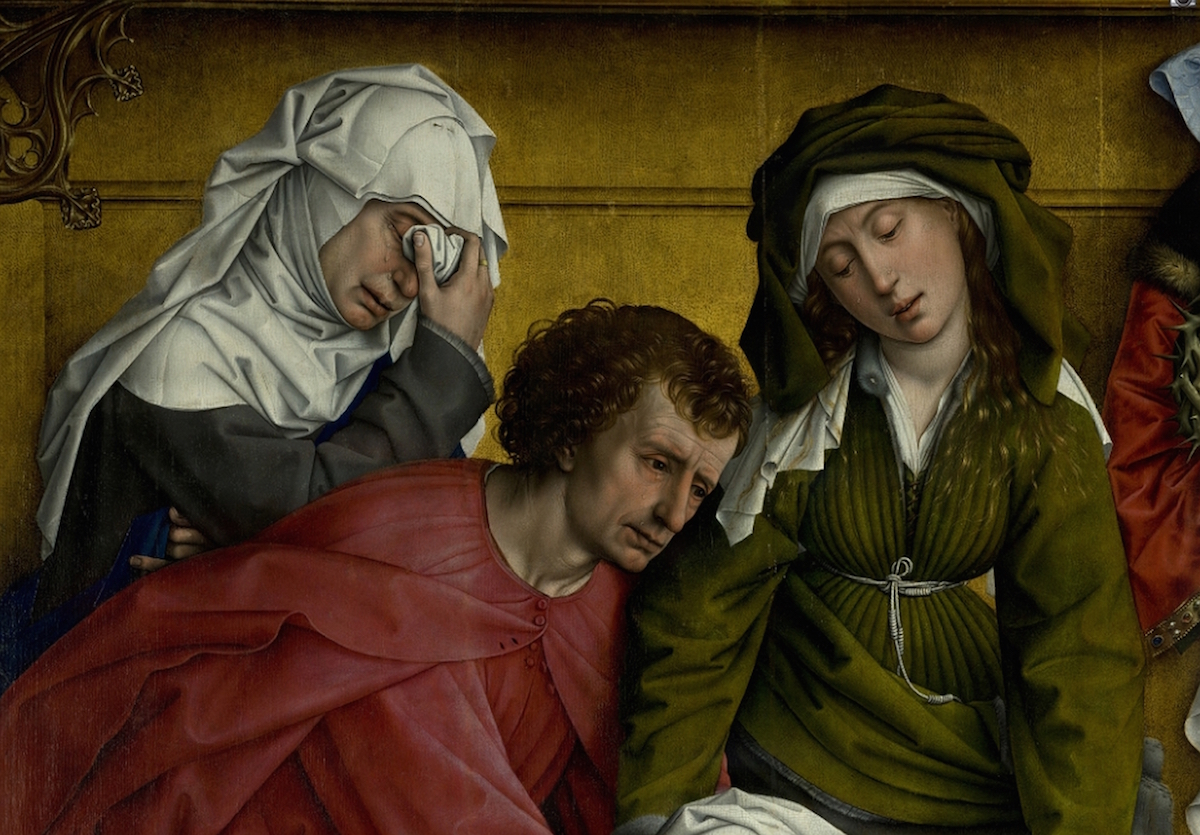
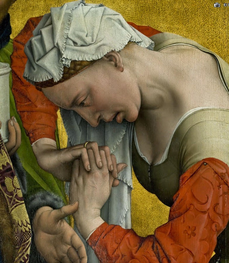
Detail: From l to r: Mary Cleophas, St John and Maria Salomé. The Deposition of Christ, Rogier Van Der Weyden
To her left is St John the Apostle, youngish and barefoot, as was customary in most Christian iconography. His left foot treads on the Virgin Mary’s cloak as he lunges to soften her fall. His cheeks and eyelids are reddened, wrinkled and swollen with tears. Although his eyes continue to stream with emotion, his face is set in a numb expression of absolute sadness and sorrow. The pigment used for his crimson tunic was made from one of the most expensive ingredients available – kermes dye, extracted from the dried red bodies of female scale insects.
Facing diagonally forward, Mary Cleophas fills the upper left corner of the niche outside the central oval. Partially hidden behind the hunched semi-circular figure of St John, her grey apparel continues on the monochrome blocks of primary colours surrounding her and culminates in a cascade of white folds and pleats covering her whole head and neck and held in place with a small pin at the top. Mary Cleophas is of mature age. The whole psychological burden weighing down on her is concentrated in her hand gestures. With her left, she clutches a dark blue cloak across her chest, the little finger alone oddly protruding straight out from her clenched fist for reasons known only to he who decided to paint it that way. Her right hand, with a wedding ring on its middle finger, dabs at her brimming, semi-closed eyes with the scrunched tip of her headdress. A full seven tears in what is essentially only part of an obscured partial profile.
Detail of Mary Cleophas. The Deposition of Christ. Rogier Van der Weyden.
To the right of Christ’s prone body and holding his legs is Nicodemus, a rich Pharisee known for bringing myrrh and aloe for the embalming before burial. He wears a black, pointed hood and clothing identical to that of Jan Van Eyck’s Chancellor Rollin in the Louvre painting: a doublet of velvet damask in purple and gold edged with fur. There existed at that time a hierarchy of cloths and colours. At the Bourgogne court, the highest echelon wore gold threaded garments, whilst the rung below wore gold braid, then satin print, followed by damask and finally plain silk. Colours also had a status: gold first, then crimson with a little black, followed by black with a little crimson.
Behind Nicodemus stands a bearded servant dressed in green and cradling a white ceramic jar with the embalming perfumes in his right hand. His left hand, thrust between his master and Mary Magdalene, as if to separate them, creates a foreshortening to the verism, albeit hesitantly.
And lastly, the figure of Mary Magdalene whose emotionally charged presence closes the painting to the right. She embodies the tragedy of having witnessed the death of he who had saved her from public execution for adultery by daring her persecutors: “Let he who is without sin cast the first stone”. Her elbows raised high and her fingers tightly clasped under her chin in a gesture of prayer, her purple cape slipped off, exposing her bare décolleté, the trauma evident in her pose leads us to believe she is about to fall at the feet of Christ, those same feet she had once so lovingly anointed with oil and dried with her own hair, and that are now bloodied and dead.
Her dress also is a lesson in the fashion of the day: sleeves were normally worn short so she has tacked on a longer, red velvet pair with a small metal pin. The hem of her green dress is edged with thick velvet and her hips balance an ornate girdle belt that spells out the letters IHESVS MARIA. The buckle consists of two metal ovals tied with a long chain.
Strong light fills this part of the painting from above right and illuminates the exposed skin of Mary Magdalene’s vulnerable back and neck. But one’s mind’s eye is drawn back again to the mysterious belt and what its significance might be.
Inside the Golden Box
The ultra-modern style in which Van der Weyden painted his figures and their expressions contrasts sharply with the unreal and anachronistic frame he sets them in. It’s a crowded horror scene squeezed inside a lantern or gold trinket box and recalling the reliefs of antiquity. An old instinctive reflex from the artist’s sculptor training of the past? Or is it, rather, his natural tendency to pit the two against each other in order that the supremacy of painting shines through?
And why does Van der Weyden, a highly accomplished painter of skies and landscapes, renounce them both in favour of a background more reminiscent of a Byzantine icon?
The scene is set against a golden wall which, unlike contemporary flat-roofed altarpieces, has here an added section jutting upwards and outwards from the body of the painting. The two corners are decorated with false Gothic tracery of gold painted wood. The gold leaf applied over the base primer has black on black specks, blended with reds and applied copiously in order to create light and shade and give the impression of a deep perspective.
Detail: Mary Magdalene. The Deposition of Christ. Rogier Van der Weyden.
This sublime painting, staggering as much for its details as for its colours, its technique, its composition and its drama, recalls Ingres’ words: “Details perform an essential role in classical painting – to engage the spectator as they contemplate them is to touch their soul.”
(Translated from the Spanish by Shauna Devlin)
-Tears in Van der Weyden's Deposition of Christ - -Alejandra de Argos -